

We all know the saying, “don’t judge a book by its cover,” right? The truth is that most of us do. I certainly admit to having bought books in the past because I fell in love with the cover. But I think we all can agree that a cover can and should say a lot about the book.
I am very fortunate to work with great cover artists who are amazing at taking the little information I give them and coming up with covers that truly speak to what’s inside. Of Scales & Fire is no exception. Here’s a quick rundown on the symbolism of what’s in its cover.
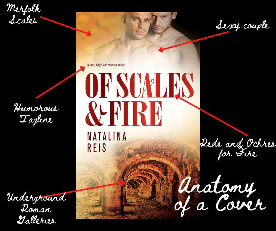
- On the top background there are scales, but not just any scales. Merman scales. How do I know they are merfolk’s? Well, you’re just going to have to trust me on this.
- Our lovely and sexy couple “crowns” the cover and hints at the interracial relationship of my two main characters, Aiden and Naël.
- The tagline tells the potential reader that there will be lots of humor and magic creatures in the story within.
- The color scheme of reds and ochres point at the earthy and fiery tones of the setting, the main characters’ relationship, and the plot.
- The bottom part is taken by a picture of underground Roman galleries, one place where a very important and revealing part of the story takes place.
Does this look like something you’d be interested? Grab a copy now.
